Dress up your door

Yarn Wreath Tutorial.

Crumb Cake

Who would've thought?

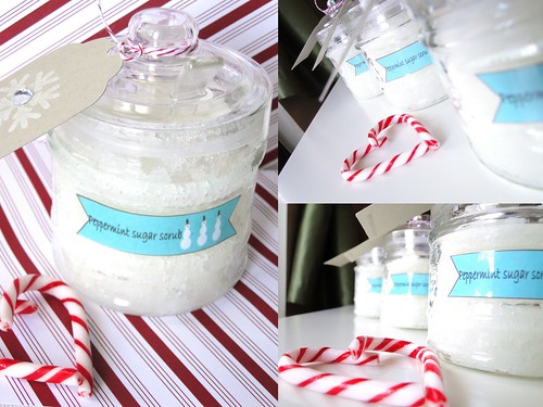
Coconut Sugar Scrub

A simple, yet luxurious gift. Don't forget to make one for yourself!

Monday, February 28, 2011

CASE: collaged word background

I mentioned in my previous post that I had a custom order for birthday cards, 2 feminine, and 4 masculine.  I’ve always struggled with masculine cards; I want to add flowers, or ribbon or rhinestones to everything.  The simple designs I do like for masculine cards…I tend to repeat them. I was searching around the blogosphere for some inspiration, and stumbled upon My Paper Secret.  Cristina has some amazing projects! I really love her style.  I found this post about creating a card with sentiments from several sets.  I thought this would make a really great masculine card, and used a colour challenge of green (SU Pear Pizzaz), red (SU Cherry Cobbler) and black (SU basic black) that I also found on her blog.


I pulled out all my birthday stamps and set to work on some scrap paper.  It was a disaster.  I also ran out of room, knowing that I wanted to put an image of a gift on the left side.  After numerous tries, I whittled the number of stamps down to just two, and decided to repeat them.

I masked the gift (that’s also paper pieced) and started the Happy Birthday! across the page.  Both sentiment stamps are SU, but from two different sets (On your birthday and Birthday Whimsy).  I used a LOT of scrap paper before I was happy with it enough to put on the card. 

I think this could be a really great technique and I’ll be looking to see if it works better with some of my other stamps.  All these stamps are also wood stamps…I can see this really working with clear mount stamps…which is why I love clear mount stamps!

I found some black eyelets and used them in the top right hand corner for balance.  I can’t use flowers on a masculine card, so I usually grab some brads or eyelets.

Try a collaged word background, I’d love to see what you come up with!

Happy Monday!

Saturday, February 26, 2011

Chocolate Mint {FTL 129}

I’ve been a little obsessed  drawn to the colours brown, teal and ivory lately.  Most of it has to do with this gorgeous My Mind’s Eye: Fine and Dandy paper I picked up last week.  Another order of birthday cards came in, 2 feminine and 4 masculine.  I did what I do best…the girly cards first! I used the Clean and Simple Fall to Layout 129; I guess I didn’t really stick to the “simple” part because I kept adding layers, but this paper is so beautiful I had to use as much of it as I could.


Both cards use Chocolate Chip as the base, and a Baja Breeze as a mat.  The sentiments are stamped on Very Vanilla, cut with rectangular Nestibilities.

I wanted to make each card slightly different, so I used Paper Source Pool satin ribbon over top of My Mind’s Eye Fine and Dandy paper. The border is punched with my favourite MS scalloped edge punch.  The ivory flowers were part of a gift from a stamping friend, and I put some adhesive rhinestones in the centres.  The light caught them with a blue tint for the picture, but they are clear rhinestones.


The second card used the same main paper, same border, but a different pattern strip down the centre.  I used some satin Chocolate brown ribbon and tied a flat bow instead of a traditional bow.  The flat bows are great for cards that are going to be mailed, no extra knots to increase the height of the card in the envelope.

Funny how one rhinestone caught blue light, and the other is clear!


Both sentiments are from SU On Your Birthday; a new set I just got last week, but have used on so many cards already…and are going to be used on the masculine cards in a pretty interesting way, so stay tuned!

Happy Saturday!


Wednesday, February 23, 2011

You Capture: The letter “L”

This week’s You Capture is all about the letter L. I really wanted to use my lomo photograph of the love sculpture in NYC I took on my trip before Christmas…but that would be cheating since I’ve already taken the picture. Looking for something with the letter L to shoot, I tripped over my laundry basket.

Laundry.

I hate laundry. To be honest, it has nothing to do with trucking it to the basement of the building to use the washing machines and dryers. Although I do wish this building had some sort of system to tell you when all the machines are occupied before you leave your apartment, so you don’t haul your basket down there, only to haul it up again.

I hate putting laundry away. I don’t really know why. I also hate unpacking; my sister believes it's because I don’t want to admit the vacation is over, but that doesn’t apply to putting laundry away.

It’s not unusual for clean laundry to sit in the basket until I’m ready to wear the clothes, never making it to the dresser or closet {don’t worry, most of my work clothes are dry-cleaned, so I’m not showing up at meetings with wrinkled clothes}. And sheets…who needs pressed sheets anyways? I’m terrible at folding fitted sheets, so why bother? If you come to visit, rest assured, the sheets on the guest bed are clean. Wrinkled, but clean.

I do love what was in my laundry basket this week. My favourite Jessica Simpson jeans. In the interest of full disclosure, I will admit they are skinny jeans. I will not go as so far as to say they are jeggings, because they are made from denim, not stretchy cotton, and have a button and zipper fly. And real pockets. I love them. I tried them on as a joke, not thinking they’d ever look good. They make me feel stylish and sexy and make my a…well, you know what a good pair of jeans can do.

You can join in the You Capture challenge over at Beth’s blog I should be folding laundry. Ugh. Laundry.

{I know, I know, another vintage-d photo…it wasn’t my intention but when I tried it, I couldn’t resist!}

Tuesday, February 22, 2011

My new found love for Crumb Cake.

No, not the dessert, although I do enjoy a good coffee cake. A few months ago, Stampin’ Up (SU)introduced new colours to the line, replacing some of the standards. One of my favourite card bases is Kraft, just like the brown Kraft paper. It coordinates with so many other colours, and is great for both masculine and feminine cards. Wouldn’t you know, they replaced Kraft with Crumb Cake. They also introduced matching ink and, I believe, a marker for the Crumb Cake colour.

I know what you’re thinking…Steph, it looks the same. So if it looks the same, why did they change it!?!? And it’s not the same. I went on a protest. I wanted nothing to do with Crumb Cake, but ran out of Kraft paper and couldn’t find a reasonable, heavy weight substitute. So I ordered a pack of Crumb Cake, and the matching ink and pouted.

I’m sorry Stampin’ Up for ever doubting you. I love this colour, and the ink…well, it’s the perfect shade to use for distressing.

I made a giant lot of Birthday cards this weekend, and quite a few of them feature, you guessed it…Crumb Cake.

Look how great these distressed edges look! Crumb Cake. Who knew?!

I went a little crazy and distressed every single edge on all the layers on this card, but I’m really happy with how it turned out.

I’m also really loving this paper by My Mind’s eye. I have trouble making cards for little kids, I don’t have many children’s stamps so this paper is perfect.


This card uses my new birthday sentiment set “On your birthday”, also by SU and has some really cute sayings. I love how you can write the age in the brackets on this one.

I love this layout, I think it’s from Mojo Monday around Christmas time, you can find a link to Mojo Monday in my Inspiration header at the top of the page.


I’m playing around with different ways to photograph the cards, there’s only so many angles you can do, KWIM? I really like this angle, what do you think?

Happy Tuesday!

{ps- did you notice things look very different around here? what do you think of the new look?, I’d love some feedback!}

Sunday, February 20, 2011

You Capture: Warmth

It’s been forever and a day since I’ve been able to play along with the You Capture challenge at I should be folding laundry.  I’m determined to get back into it, and practice more photography. Unfortunately a weekly photo challenge doesn’t suit my new found love for shooting film, so I’m using my lovely Sony HX1 digital.

This week’s theme is ‘warmth’ and it seems very fitting for a number of reasons.  We had two glorious days of spring weather this past week, but Friday night, the wind started to howl and we’re back below zero. We’re also expecting 15-25 cm of snow starting this afternoon (that’s 6-10” of snow for my non-metric friends).

I took this picture yesterday, while the wind was still howling (it’s sunny and calm as I write this… likely the calm before the storm). 

I wanted to edit this picture with a vintage feel; not sure why, but I was determined to do so.  After scouring the internet for tutorials, silently cursing (ok, not so silently) the lack of ‘curves’ in PSE, I stumbled upon, what could be, my new favourite place on the world-wide-web.

The Coffee Shop blog is a mecca of all things photography and editing.  I haven’t finished exploring her site, but she’s generously provided many freebies, including a Vintage Action for PSE.  Jackpot! No more trying to fiddle with layers and non-existent curves in PSE.

Here is my shot for ‘warmth’, a nice cuppa.

You can see all the details, and join the You Capture challenge on Beth’s blog I should be folding laundry

Happy Sunday!

Ciao for now,

Thursday, February 17, 2011

Remembering Vancouver 2010

While most of my blog revolves around paper, those of you who have been following me since the beginning know that there’s something else that makes me smile…the Olympics.

I shared with you last year my trip to the Vancouver 2010 Winter Olympics.  This week marks the one year anniversary of one of the most successful Olympics in Canadian history, and the Games that unified the country. 

Red mittens were seen around the world and became the unofficial symbol of the Games.


I had the time of my life in Vancouver 2010, I still have a hard time putting the experience into words.  It was a dream come true, and something I will never forget.

I’ve often shared my photos with you, and now I share a glimpse into what my home looks like, decorated with those photos.  I look at this wall every day when I walk into my living room and remember the atmosphere that was Vancouver 2010. I remember the pride I felt when I heard my National Anthem being sung in the streets; the joy I felt seeing our athletes receive their medals, acknowledging the years of hard work and sacrifice.

I remember that dreams can come true.

You can see a collection of my Olympic photos here on my Flickr page including the ones you see on my living room wall.

What do you dream of?

Ciao for now,

Tuesday, February 15, 2011

Collaged Nestibility background

I’m a huge fan of Spellbinders Nestibilities.  It’s rare that I make a card without using one die-cut from my growing collection.

I can’t recall where I saw this idea, but it’s stuck with me and I finally had the chance to try it out.

I used scraps of paper left over from the Love edition pillow boxes I made for my Etsy shop , and arranged/adhered them on a piece of cardstock.  Then I used one of my Nestibilities to cut out the collage, and it created a great background for this card.

This is a great way to use up scraps of patterned paper, while creating a unique background or focal point to the card.

I’m already making little piles of scrap paper that work together, so I can make some more collaged background shapes to have on hand.

Go and try it, I’d love to see what you come up with!

Saturday, February 12, 2011

Green and Grey and oh so sweet

Last week I received a call from a local customer (I highly recommend registering your business with Google places) who needed a Congratulations card for a best friend who is expecting her first baby.  My customer told me her friend’s favourite colour is green, and she loves trees.  They don’t know if the baby is a boy or a girl, and I had free reign to make this card as heavy and bulky as I wanted because it was being shipped Fed-Ex.

As soon as my customer mentioned trees, I thought of one of my favourite Inkadinkadoo stamps, with three small birds in a tree.  I thought it fit perfectly because the three little birds are a little family.  I used markers to ink up the tree and the birds, added a layer with my Spica glitter pen (it’s hard to capture in the picture), then coloured the leaves with two shades of green marker.  I used a blender pen to pull in some of the brown colour from the outline of the tree; I didn’t want to colour it completely. You can click on the picture to see it close up.

I used the MojoMonday 176 sketch for the layout and made the card 5.5” by 5.5”.

I love these little ivory flowers, they were a Christmas gift from a fellow stamping friend, and they worked great with the BoBunny paper I used.  A simple “Congratulations” was stamped in grey ink and added some balance to the bottom corner.  Of course, I had to add rhinestones, but I think it pulls it together quite well.

I love being able to do custom work, and my customer was very happy with the results!

Happy Saturday!

Ciao for now,

Tuesday, February 1, 2011

Fresh start for February: How to organize your business ideas one day at a time

Balancing an online shop with a full-time job, family, friends and household commitments can be difficult at the best of times.  In addition to creating our products, we have to photograph them, edit them, , write product descriptions, list them, promote them… Then you actually make a sale and an entirely different process plays out…blah, blah, blah.

I get distracted very easily.  Quite often while looking for paper for one card, I find something else that inspires a completely different idea/product/theme, etc.  I have a thousand sticky notes with ideas, sketches, and to-do lists.

Last Christmas season I started using a Whiteboard, mostly to write down all the items I was going to make for 3 craft shows over a course of 3 weekends.  I needed to be organized and I needed to stay focused. 

It worked!

But I started adding monetary goals, timelines, custom orders, and soon there was no “white” left on my “whiteboard” and I wasn’t accomplishing everything on my “To-Do” list.

I needed a more realistic way to stay on track the nights I come home from work, too tired to do anything.  I was haunted by my whiteboard.

Then it hit me, I needed something smaller. Something that would force me to keep my list of ideas and tasks in line with the amount of time I have during the week (slim-to-none).

I created an Idea Calendar.  A small (6x6”) calendar, attached to some cardstock to keep by my computer.

I sewed the pages so that I could tear them off easily each month, and I have a space to record new ideas on the right hand side.


The squares are small. Too small you say? No way-- there’s a method to my madness. I can only write one task in these squares, which means I’m more likely to accomplish one task each day and not be overwhelmed or haunted by my list. 

I can write an idea down when it occurs, and schedule it for an empty day. 

This means I’m 1) less likely to forget the idea 2) and more likely to accomplish it.

{Can you tell Blogging is something I 1) forget to do and 2) don’t accomplish on a regular basis? Winking smile}

This may or may not work for you, but I’m going to give this a real shot.  Today is February 1st and it’s a fresh start.

You can create your  own calendar and customize it to what suits you.

I didn’t want to turn this into a spammy promotional post, but if you’re interested in one of these calendars, I can put them together pretty fast, and can list them for sale.  Nothing fancy or covered in rhinestones, just simple and straightforward.  Leave a comment, email or send me a convo from my Etsy shop.

If you have any other ideas for organizing and finding balance between your online shop and ‘real life’, let me know!

Happy Tuesday!

Ciao for now,

Twitter Delicious Facebook Digg Stumbleupon Favorites More
This Is A Do-Follow Blog